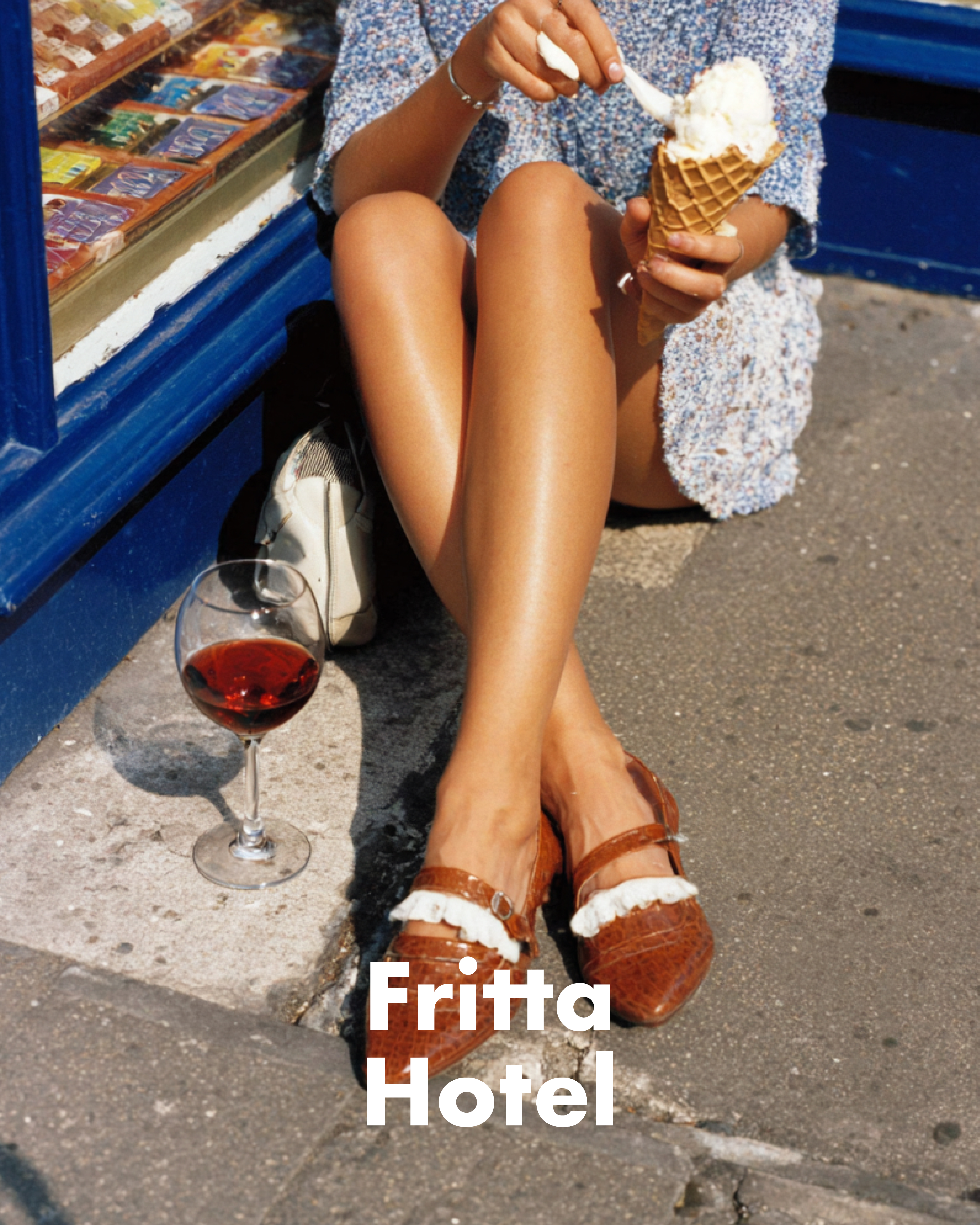
Fritta Hotel 브랜딩
Fritta Hotel(프리타 호텔)은 컨셉부터 브랜딩, 비주얼 디자인, 그리고 실제로 머무는
공간 경험까지 처음부터 끝까지 함께 기획할 수 있었던 아주 재미있는 프로젝트였습니다.
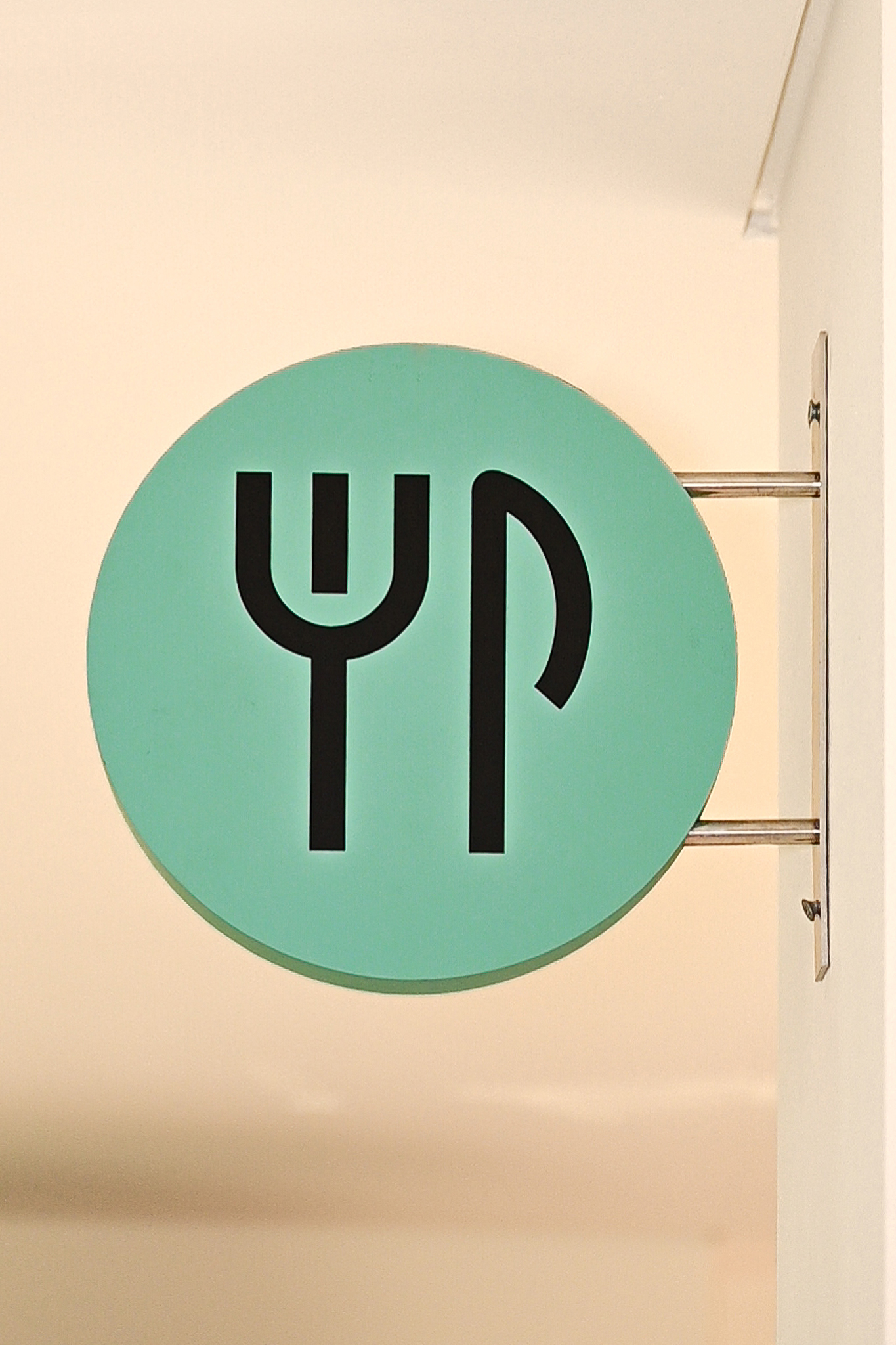
‘프리타(Fritta)’는 **튀기다(fry)**라는 뜻에서 시작한 이름으로, 남녀노소·국적을 불문하고
누구나 편하게 즐길 수 있는 공간이란 무엇일까라는 질문에서 출발했습니다.
가장 합리적이면서도 가장 기억에 남는 디자인을 목표로,
친근하고 열린 호텔 브랜드를 만들어가고자 했습니다.
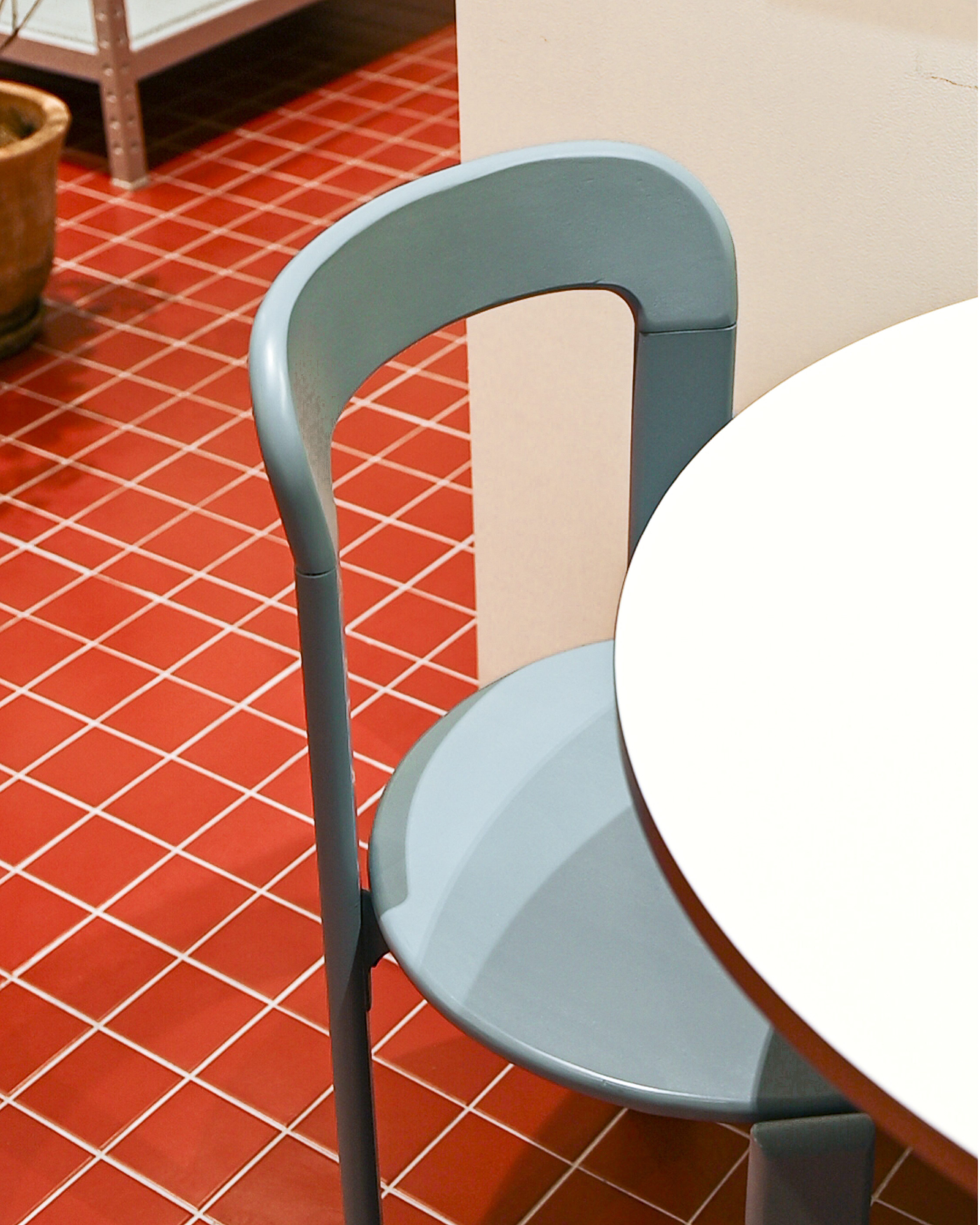
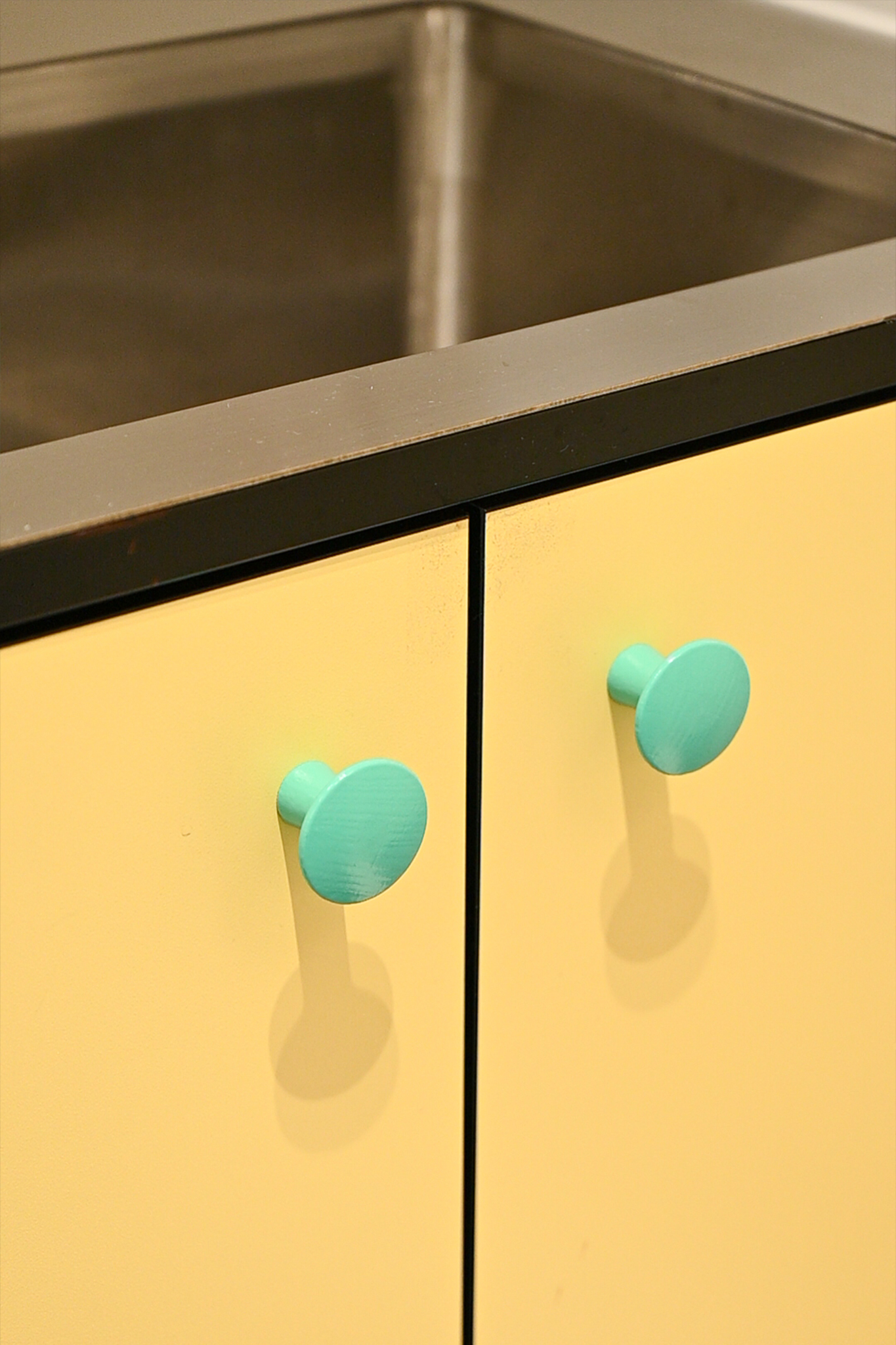
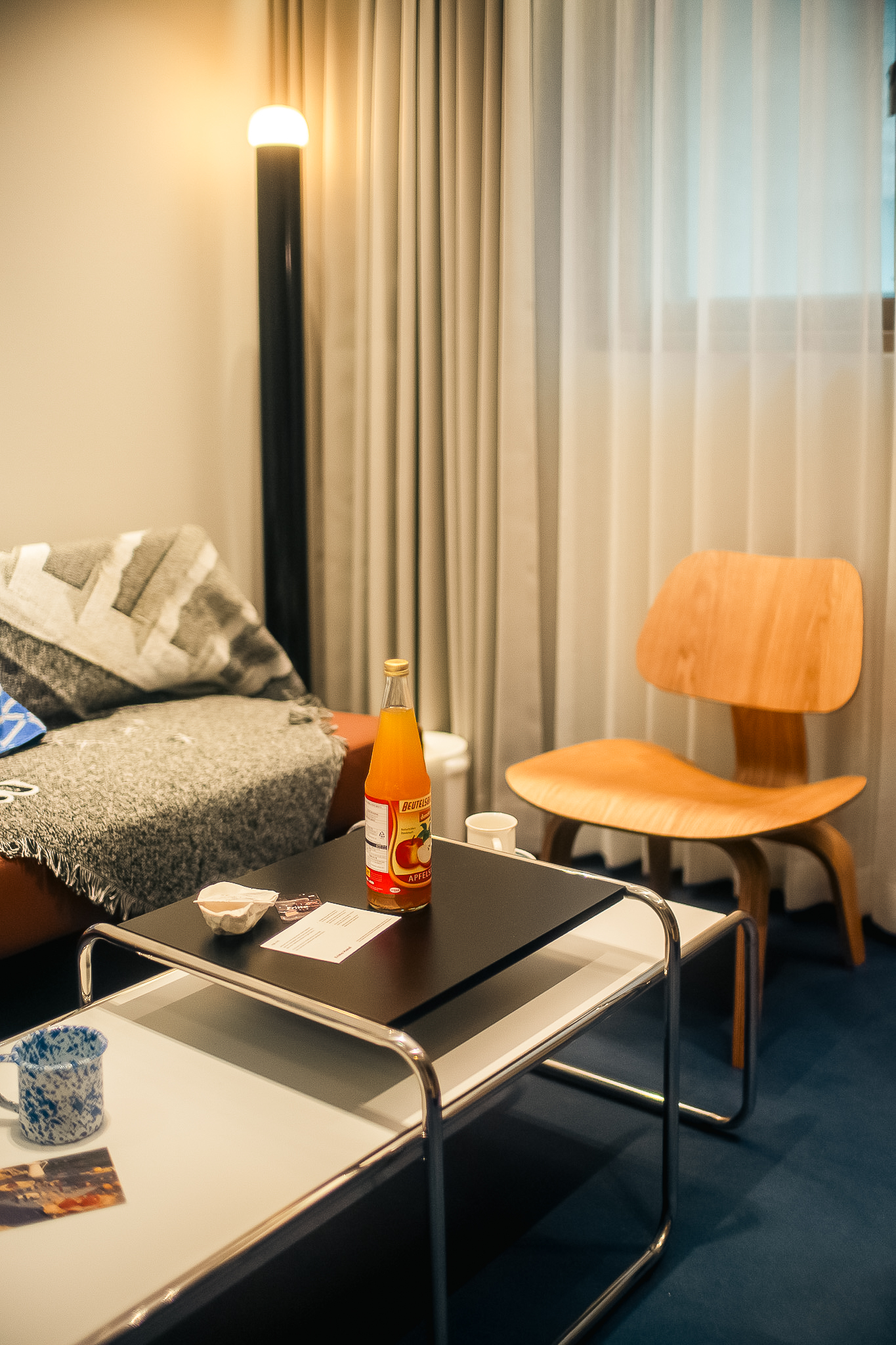
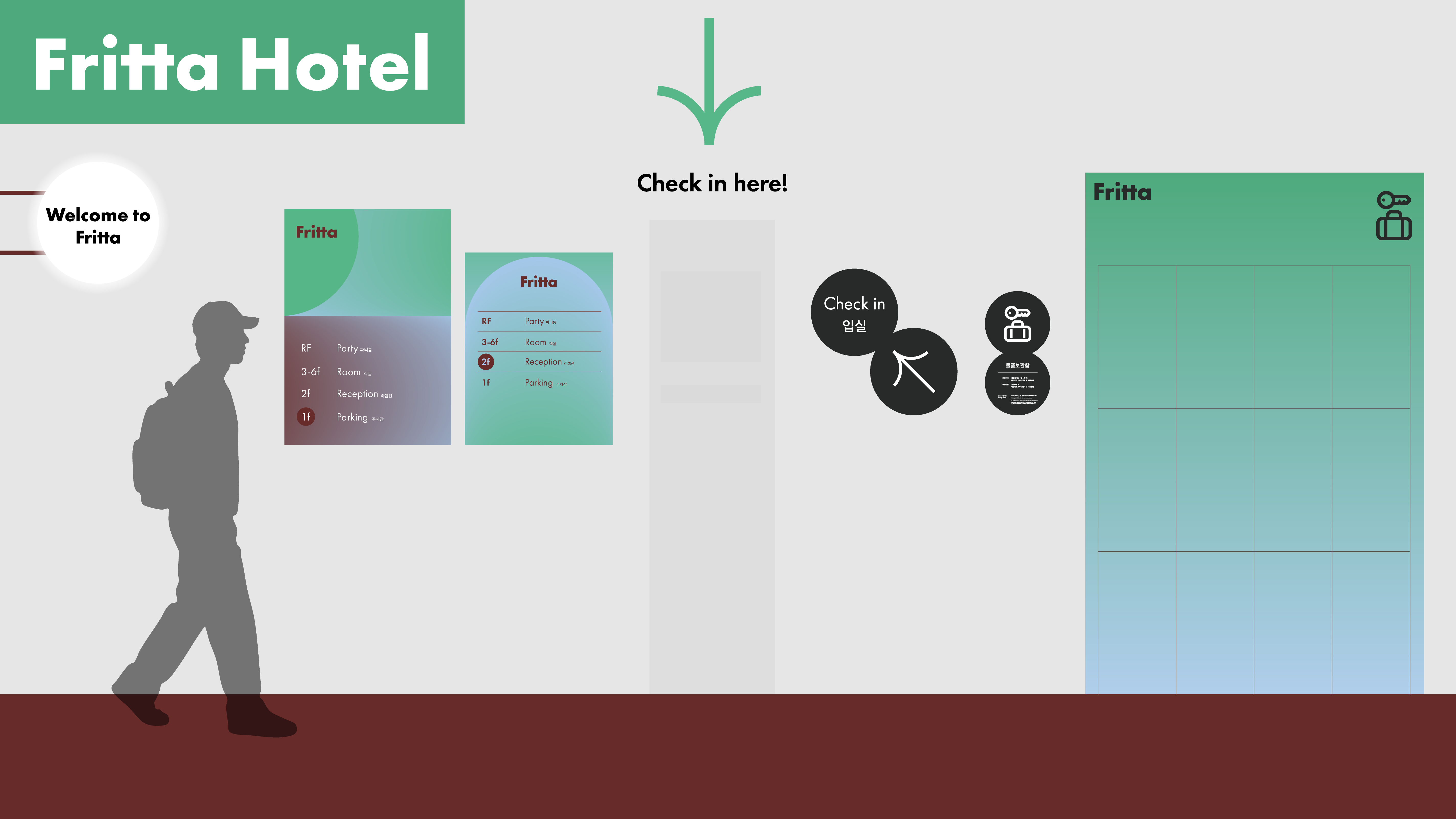
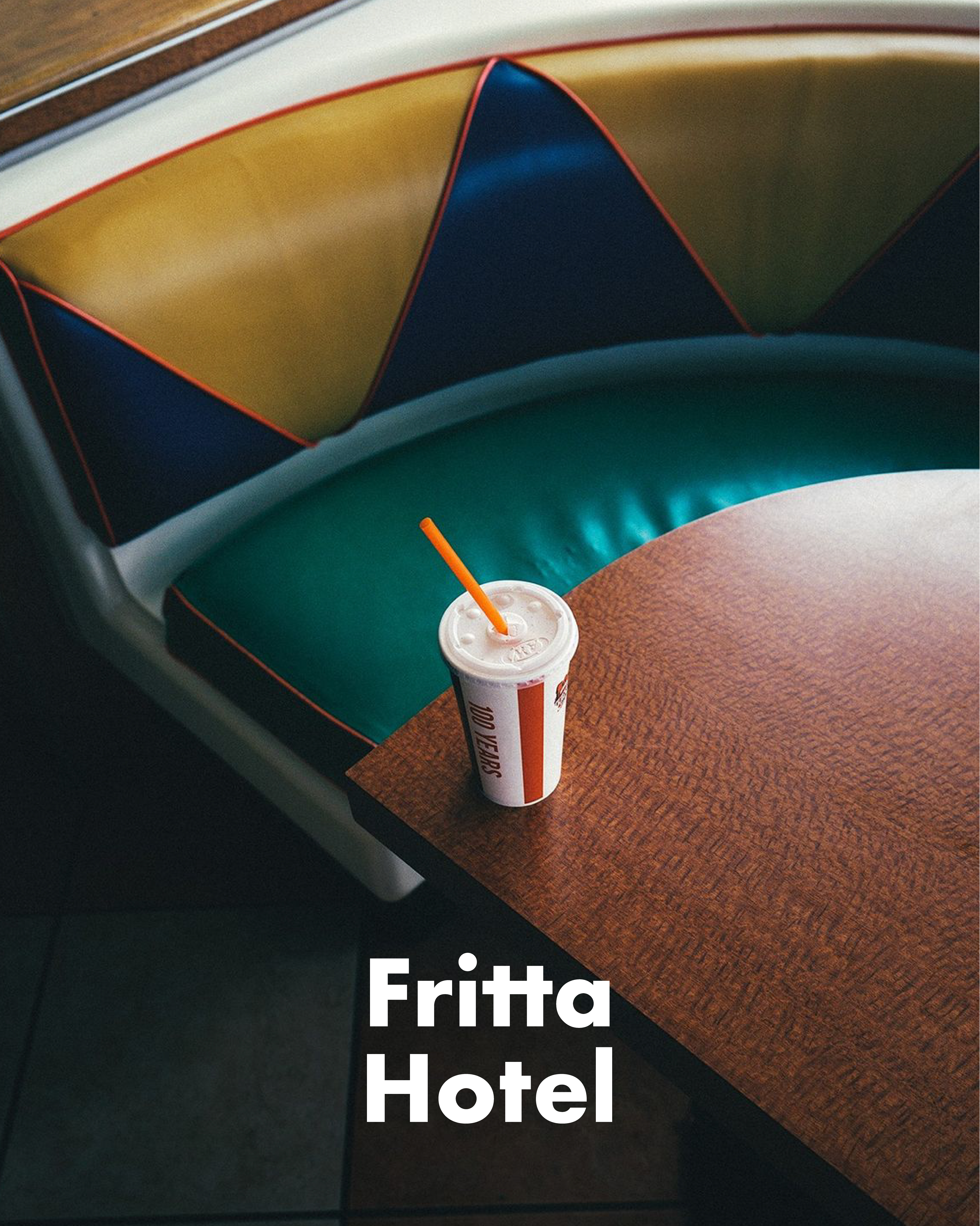
수원 팔달구의 오래된 모텔을 유럽의 캐주얼한 호스텔 감성으로 재해석하고,
바우하우스에서 영감을 받은 볼드한 컬러와 모던한 디자인 언어를 통해
모텔 골목의 분위기 자체를 바꾸는 것을 목표로 했습니다.
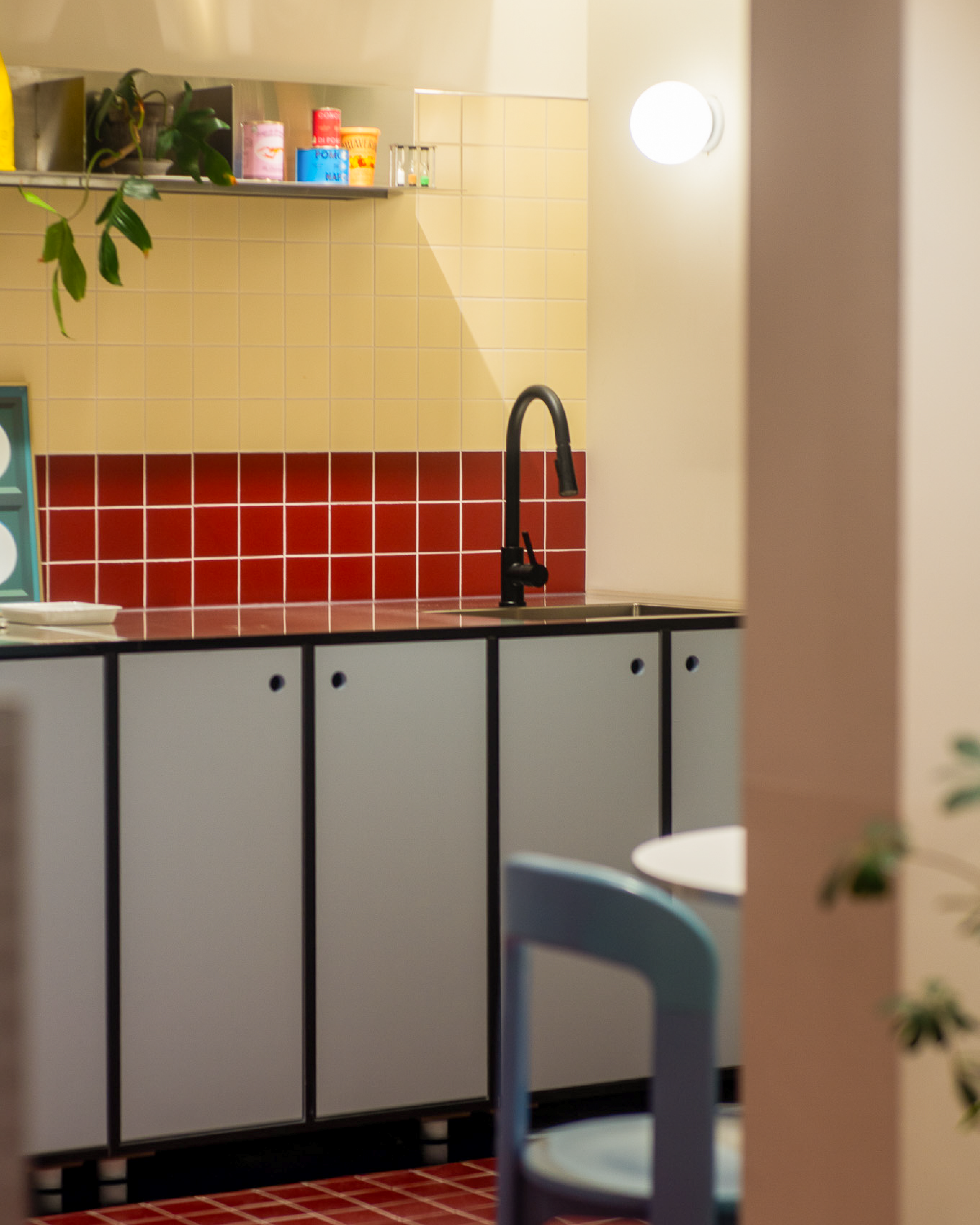
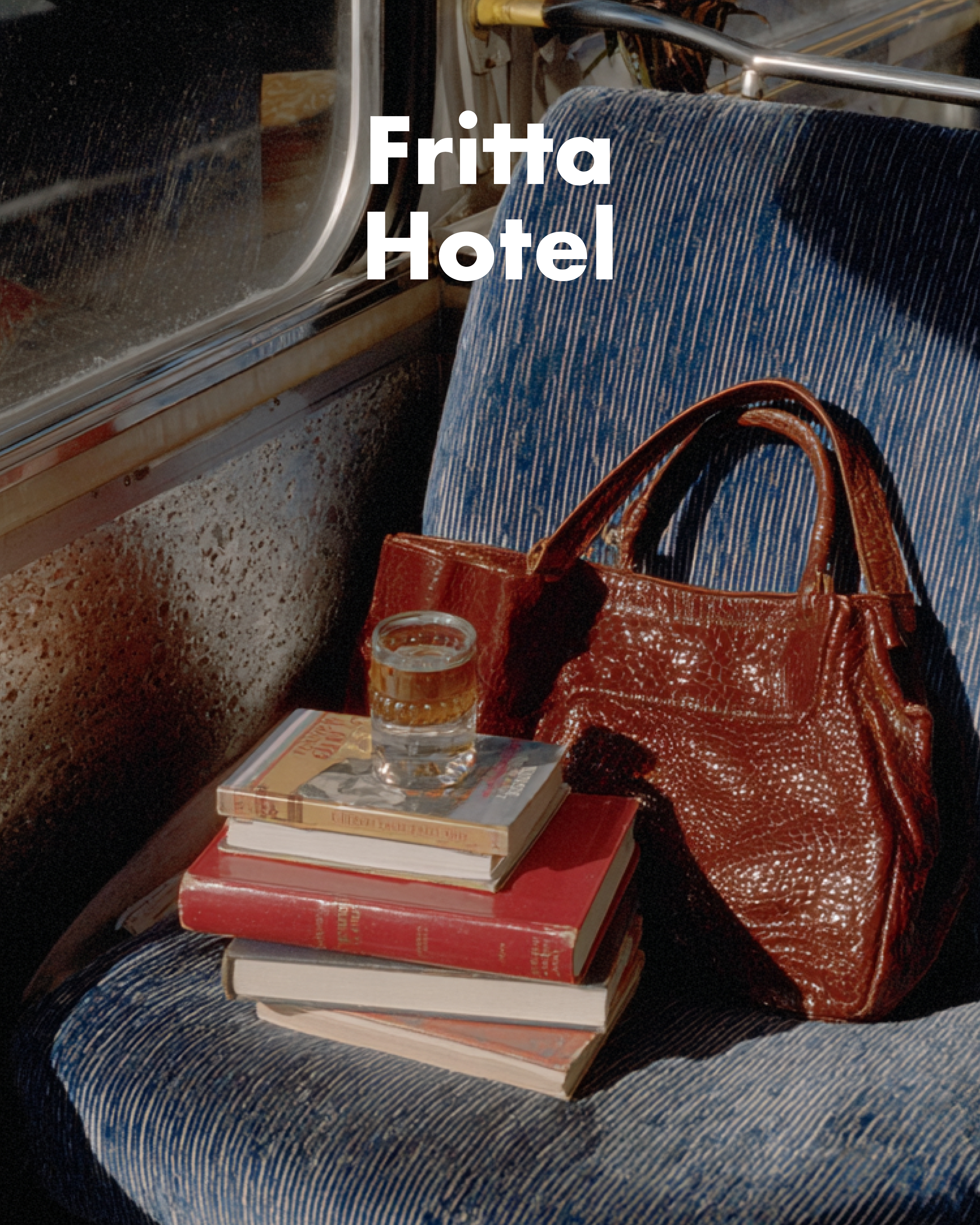
적은 예산을 효과적으로 활용하기 위해 구조와 마감을 최소화하고,
강한 컬러 조합과 그래픽 요소를 핵심 전략으로 삼았습니다.
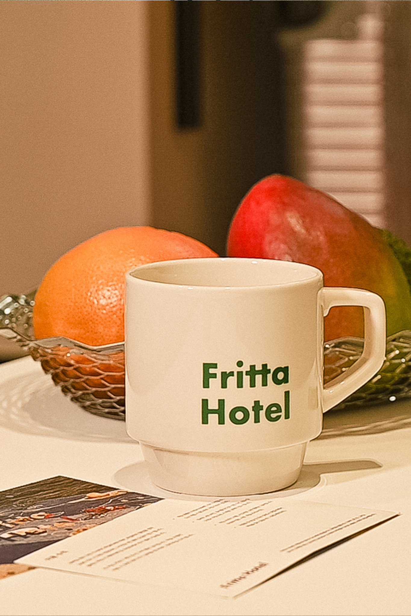
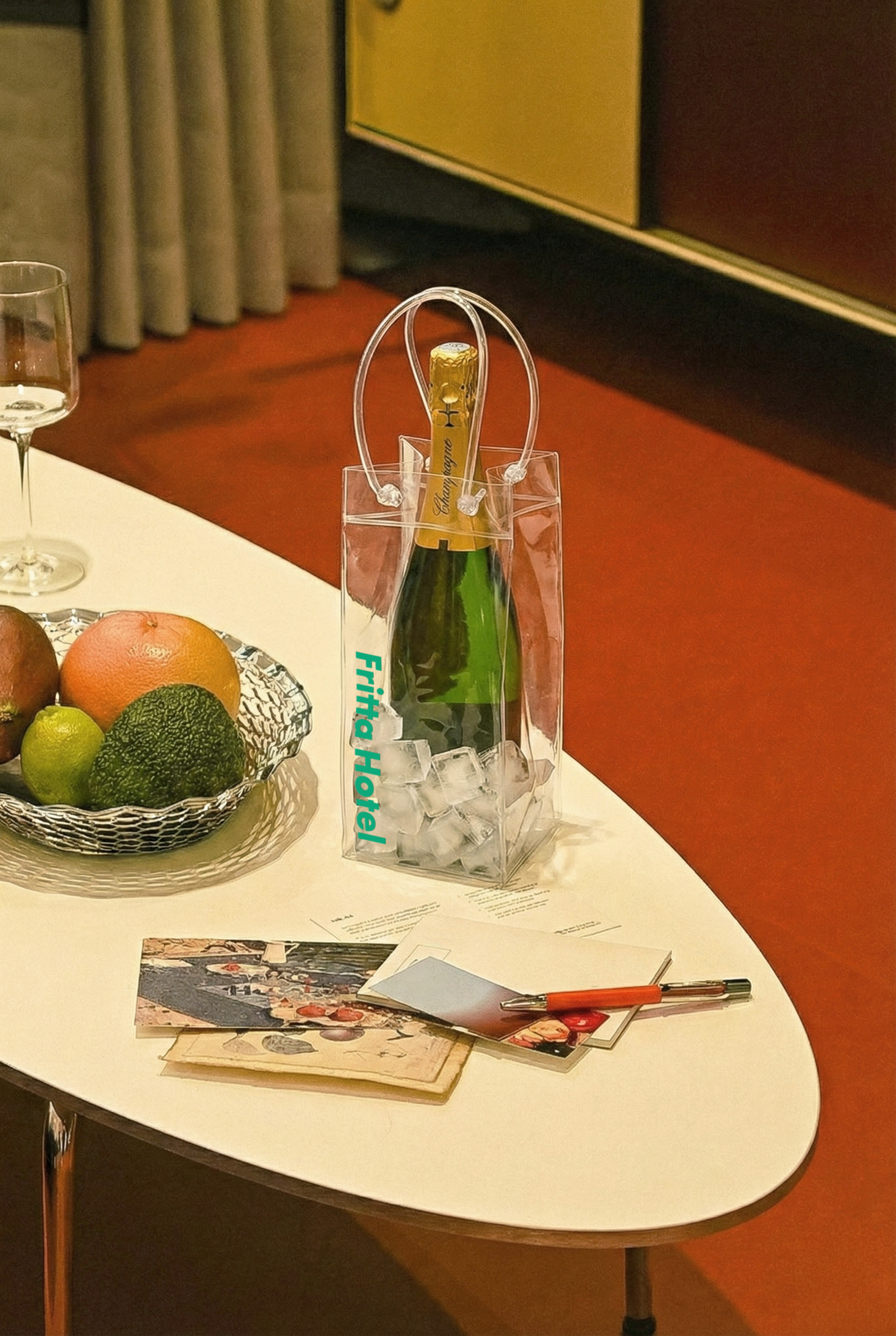
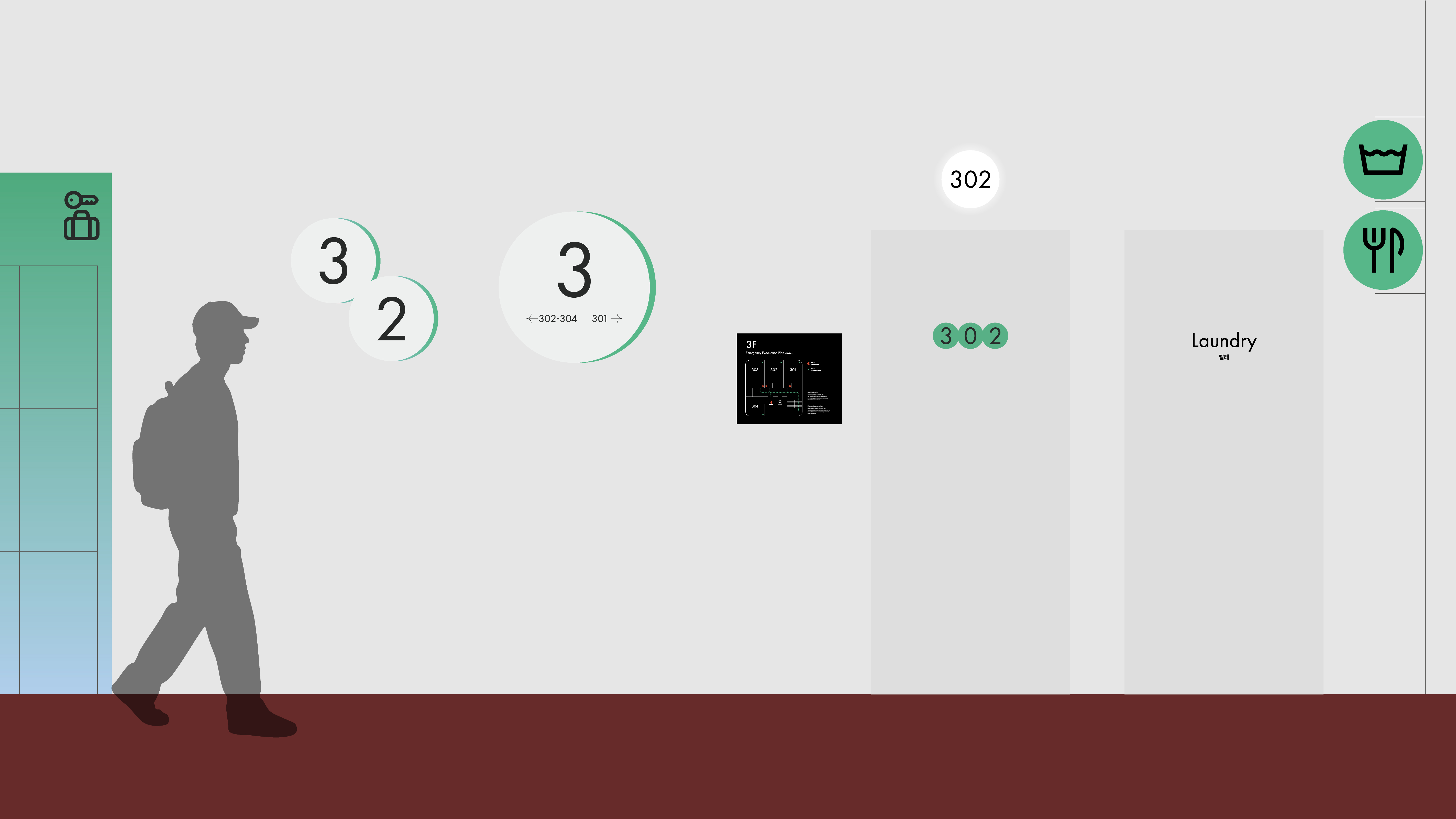
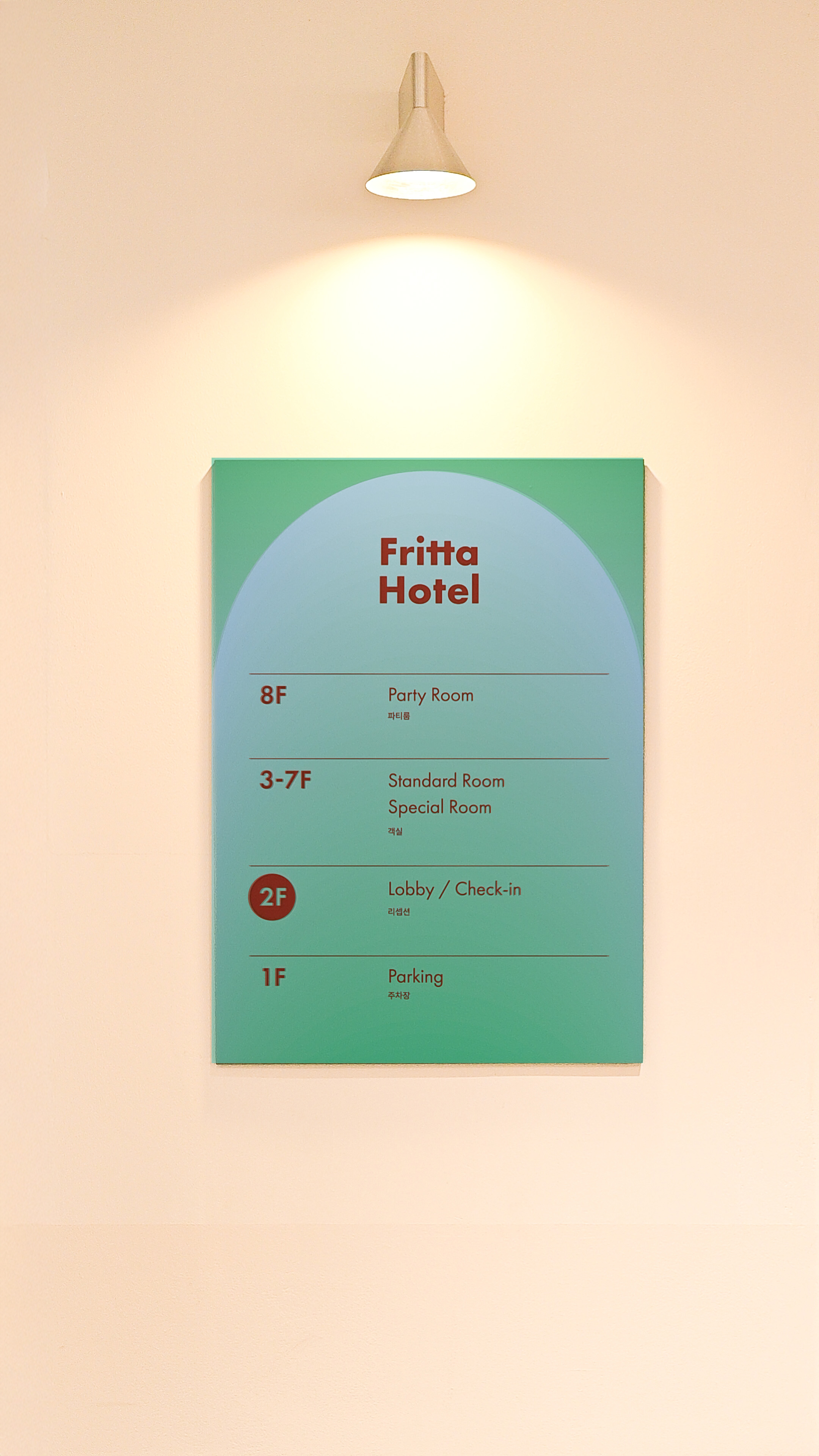
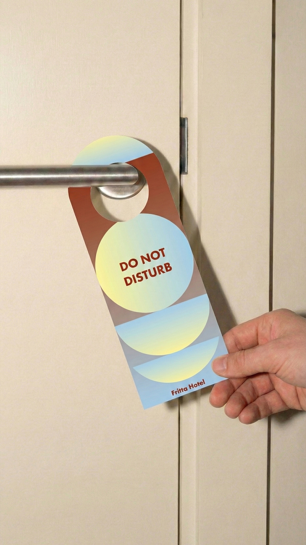
레드, 그린, 블루를 중심으로 한 컬러 시스템은 공간에 리듬과 에너지를 더하며,
수원 모텔촌 안에서도 단번에 인지되는 Fritta Hotel만의 시그니처가 됩니다.
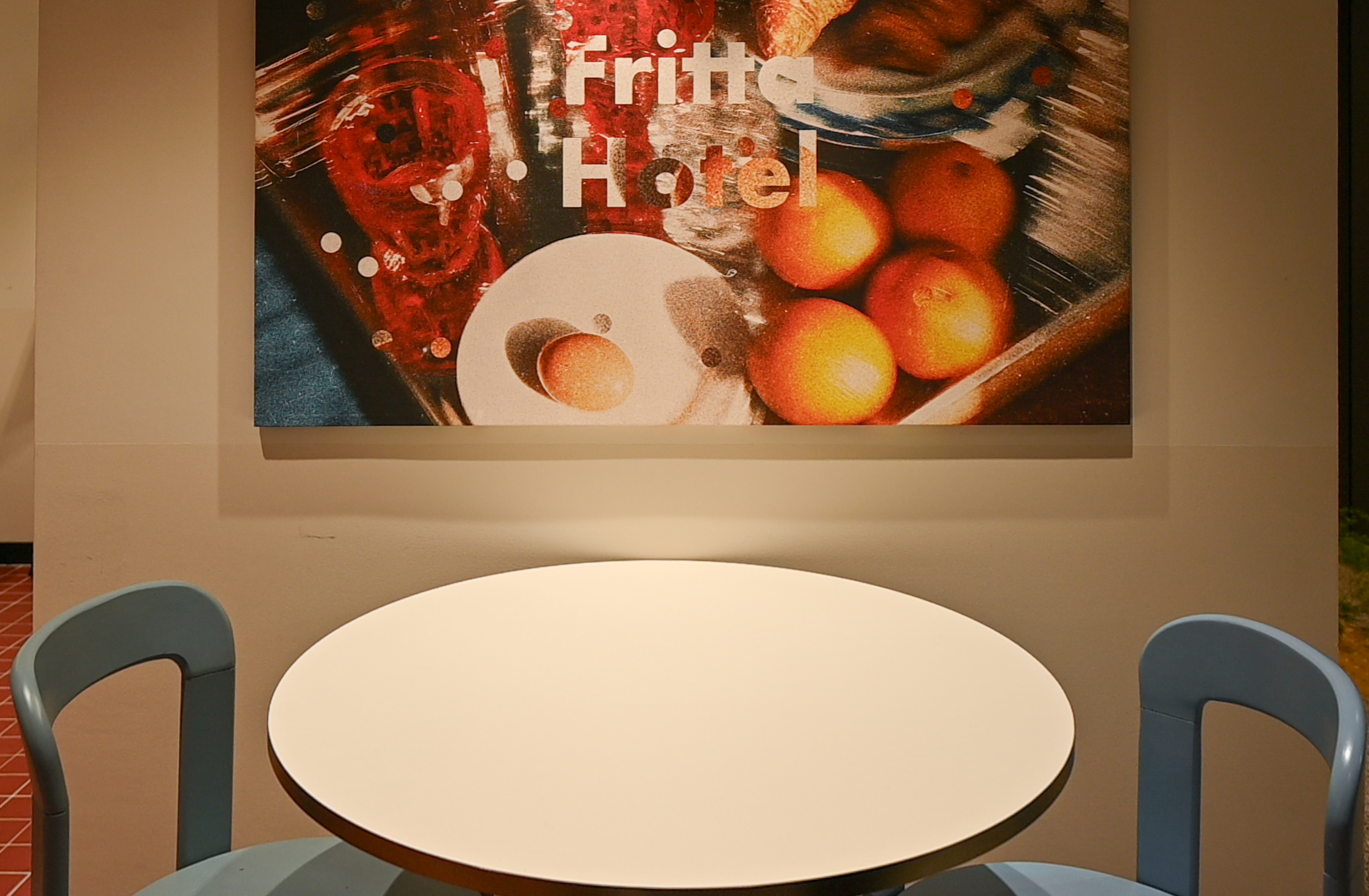
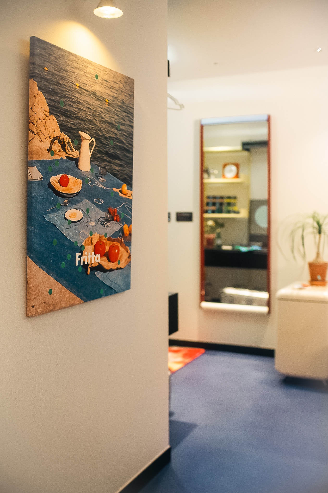
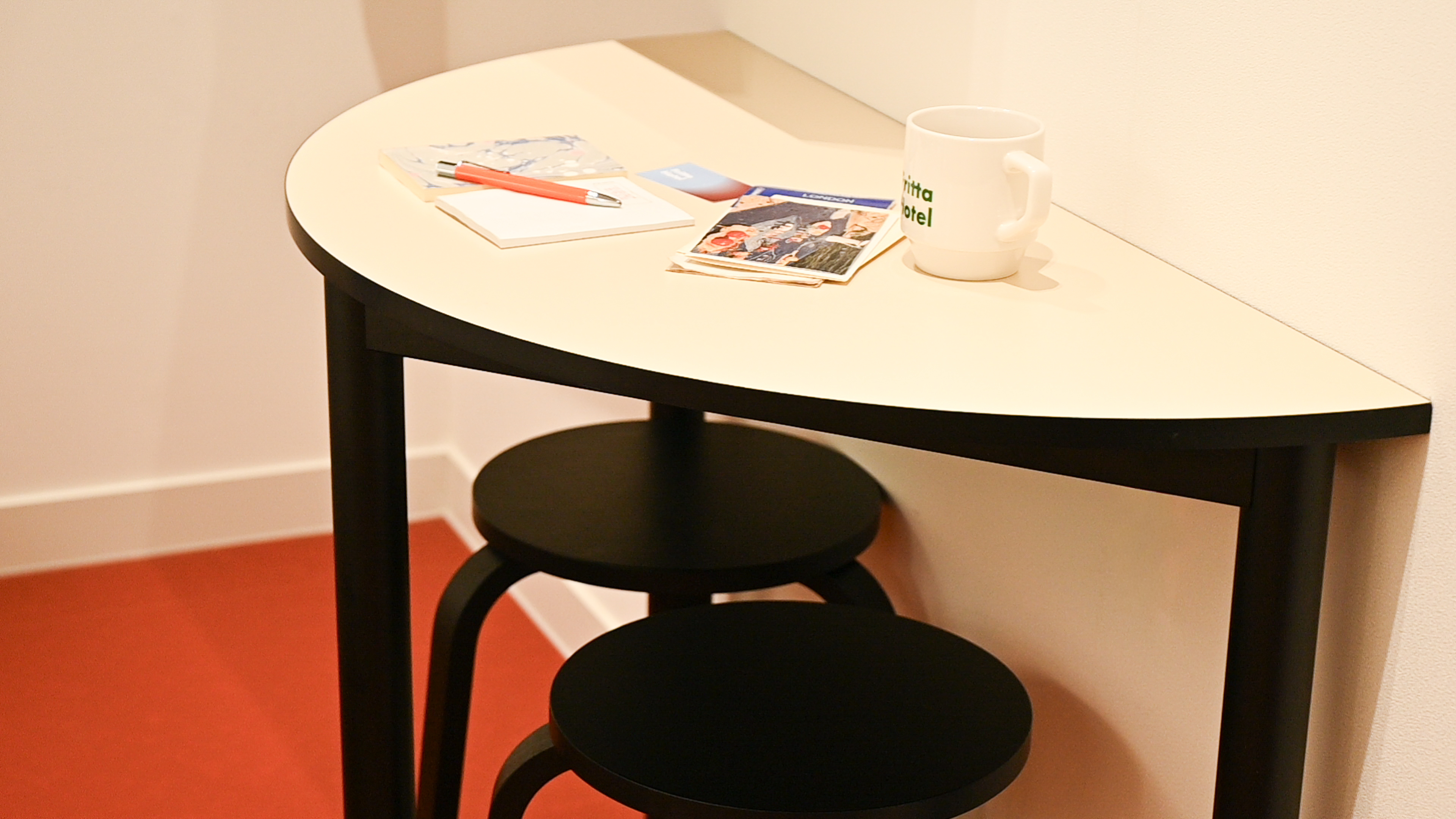
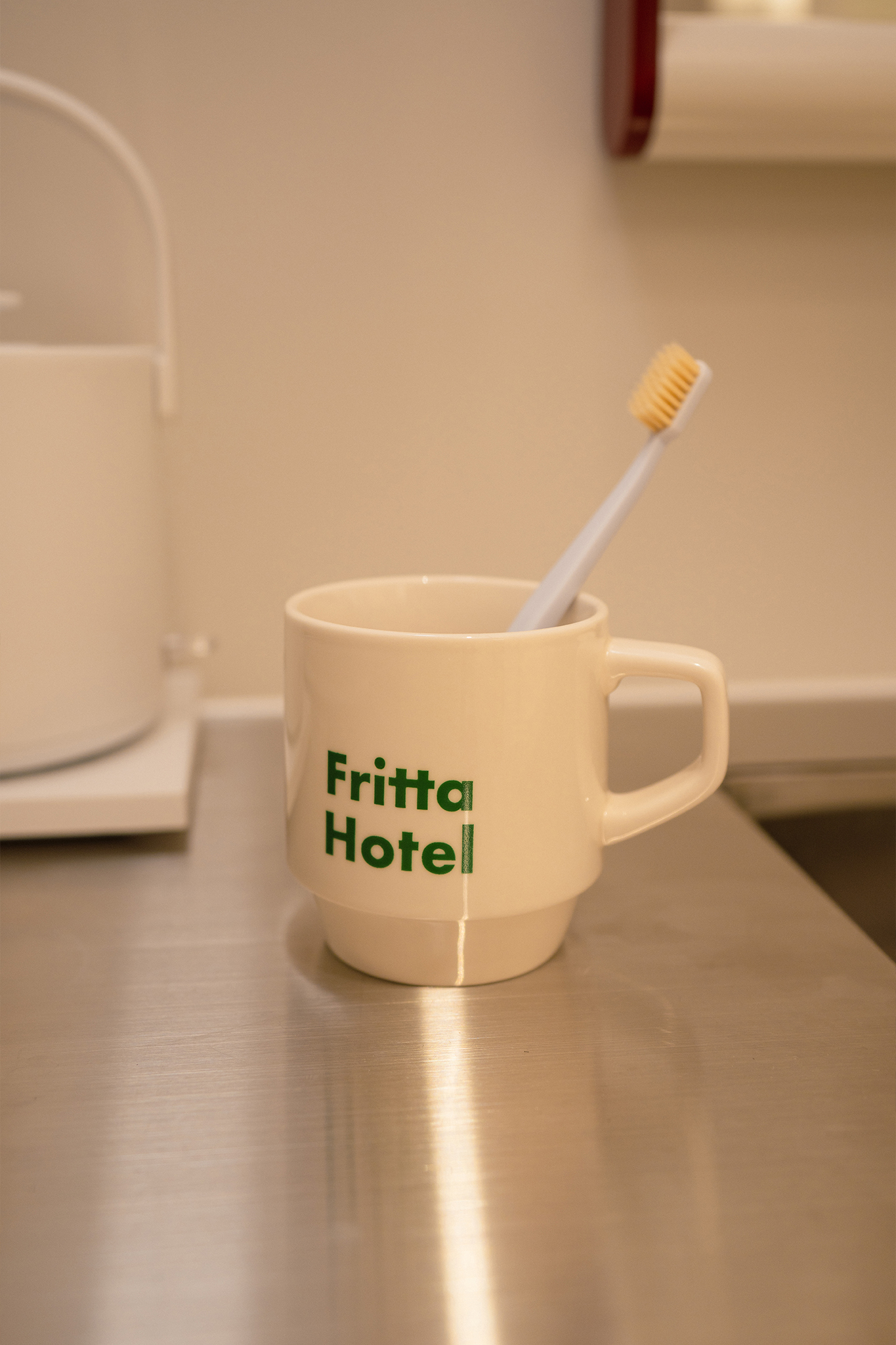
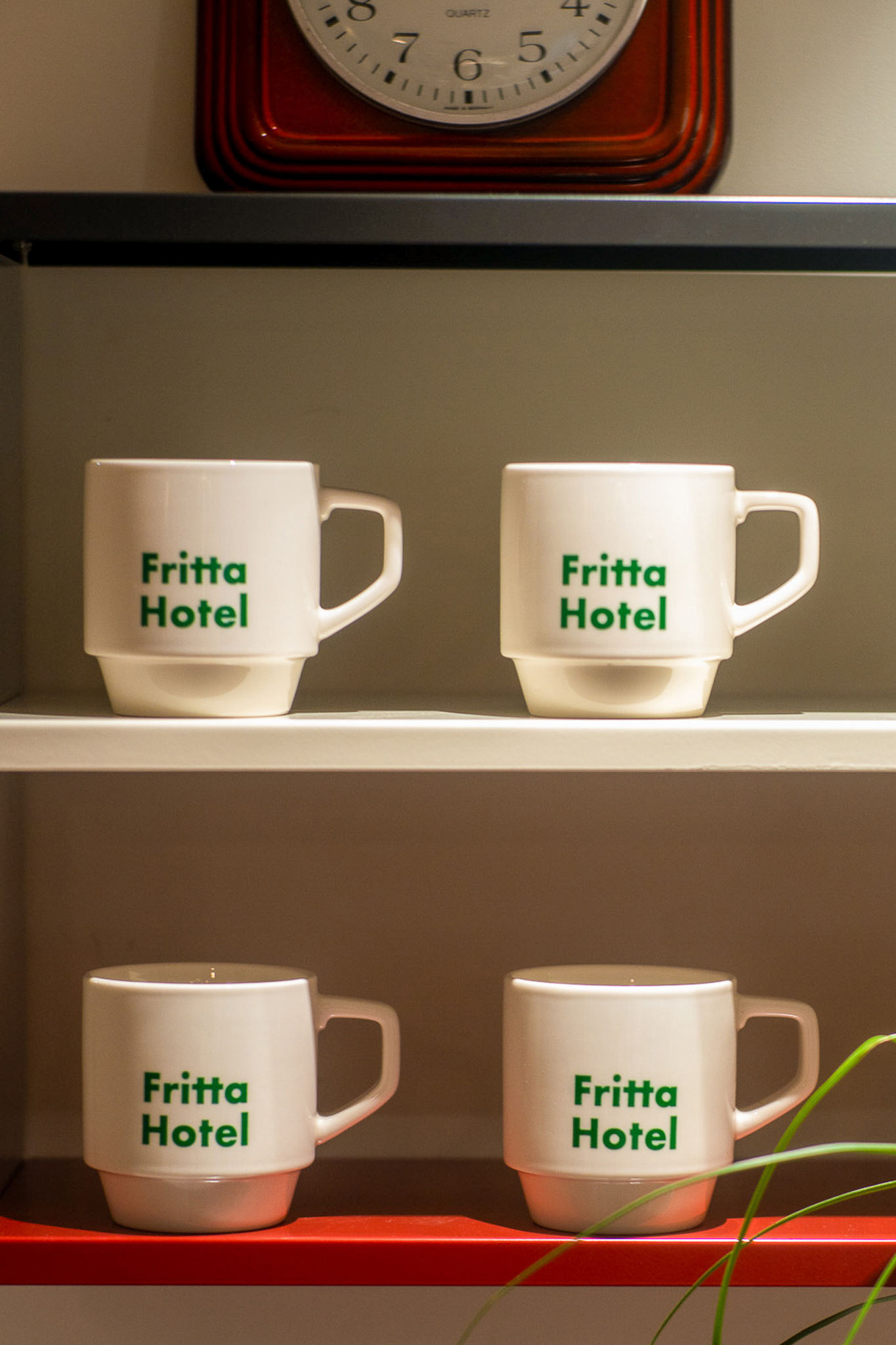
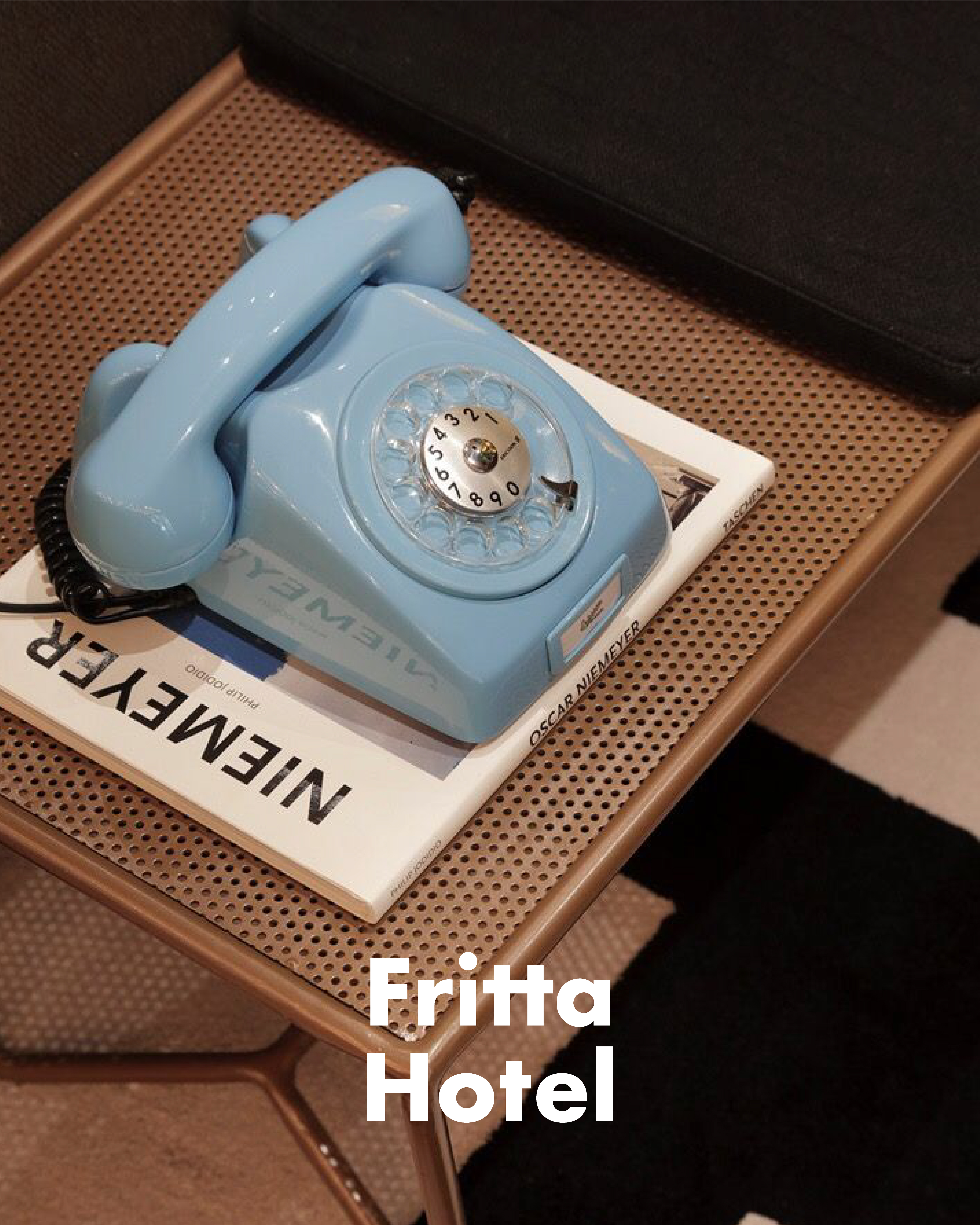
공간 디자인부터 B.I, 인쇄물, 사이니지, 인스타그램 콘텐츠, AI를 활용한 무드 이미지까지
토탈 브랜딩으로 완성한 호텔 프로젝트입니다.
Fritta Hotel is a project we had a lot of fun working on—
from defining the concept and building the brand,
to designing the visuals and shaping the actual stay experience,
from start to finish, together.
The name Fritta comes from the word “to fry.”
It began with a simple question:
What kind of space can be enjoyed by anyone, regardless of age or nationality?
With that in mind, we aimed to create a hotel that feels friendly, approachable,
and memorable—while remaining thoughtful and efficient in its design.
An old motel in Paldal-gu, Suwon was reinterpreted through
a casual European hostel sensibility, combined with
bold Bauhaus-inspired colors and modern design language,
transforming not just the building, but the atmosphere of the entire motel district.
To make the most of a limited budget, we focused on
strong color contrasts and graphic elements rather than costly finishes.
A palette centered around red, green, and blue brings rhythm and energy to the space,
creating a visual signature that stands out instantly within its surroundings.
From spatial design to brand identity, printed materials, signage,
Instagram content, and AI-generated mood images— Fritta Hotel was completed
as a total branding project.
Industry: Hospitality
Location: 경기 수원시 팔달구
Client: Fritta Hotel
Involvement: 네이밍, 브랜드 전략, 버벌 및 브랜드 아이덴티티 시스템, 공간 디자인, SNS 콘텐츠 디자인
Date of completion: 2026년 1월